
1
USA’s Department of War quietly releases new branding that isn’t at all alarming.
(www.designweek.co.uk)
🇬🇧 This is a bilingual community on a french instance.
Total subscribers:
🇬🇧 Let's discuss art and design!
Join us and
This community is about art in all its form, as well as its influence on culture and its application at the service of society: architecture, music, literature, performances, video games, graphic design...
Check the pinned posts for basic rules and a (wip) list of art related communities 🔗
🇫🇷 Discutons d'art et de design !
Vous pouvez ici :
Le sujet de la communauté concerne toutes les formes d'art, ainsi que leur influence sur la culture et leur application au service de la société : architecture, musique, littérature, performances, jeux vidéos, design graphique...
Pour toute question, suggestion, réclamation, etc. N'hésitez pas à utiliser le sujet épinglé.
✅ Les règles de l'instance s'appliquent bien évidemment.
As someone from not the US it was not clear what's going on.
The point is, this was the Seal of the United States Department of Defense since 1949:

The new "simplified" version is the one on the header image of the article:

pete- low-t hesgeth needs all these strong men and no women in the military.
The leaves on the right of the old seal are olive leaves, and they're supposed to symbolize a desire for peace (extend the olive branch, etc). The leaves on the left are supposed to symbolize honor in combat. The arrows in the eagle talons are supposed to be readiness for war. The new seal has no leaves.
Important bit:
Until recently, the US government department responsible for the military was generally known as the United States Department of Defense. Technically, it still is. It had a sub-brand, however, that nobody had used since 1947. You jokingly say “well, let’s not use the name ‘Department of War’ hahah!” and you spot that look in the client’s eye that says “brilliant! You’ve nailed it! Let’s!”
They didn’t get the joke. OK, but you crack on. Consequently, the branding team must have felt mortified when the mood board that was titled “Avoid these” was displayed with the heading set in too small a font and the government officials went “Yes! Please! That’s brilliant!” It probably looked something like this:
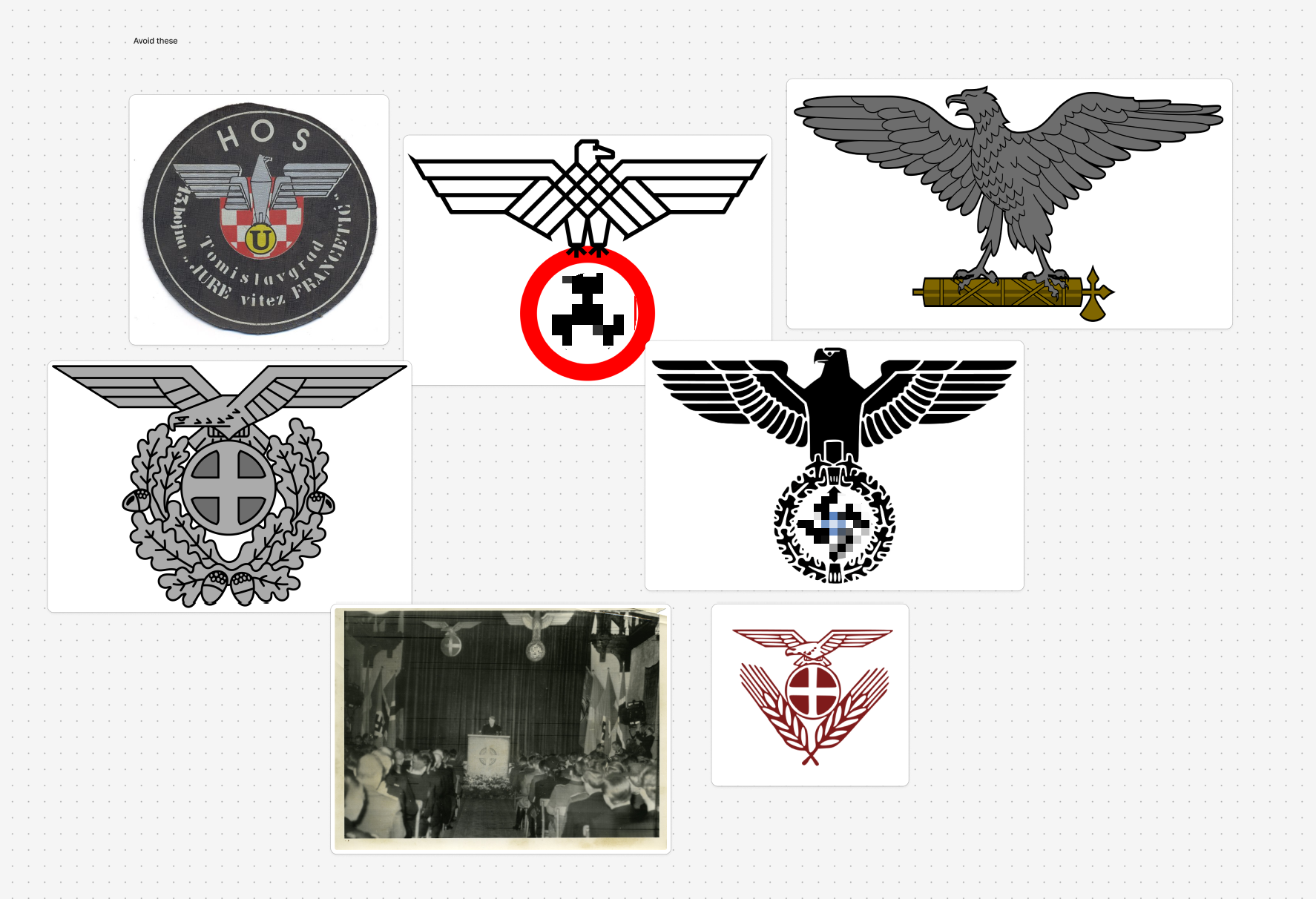
[...]
They are, of course, not the first leaders to use imagery in such a style; they’re merely looking back on nostalgic, heart warming times. It’s only a coincidence that this new branding just happens to have similarities to the less pleasant parts of European history. It’s almost certainly just a consequence of the trend towards simplifying branding for easier reproduction across multiple media types from screens and paper to large fabric banners that can be clearly seen from a distance by your ~~enemies~~ ~~victims~~ allies so they know what to expect when you’re in charge. And it’s definitely not at all alarming. Oh no. Definitely not.