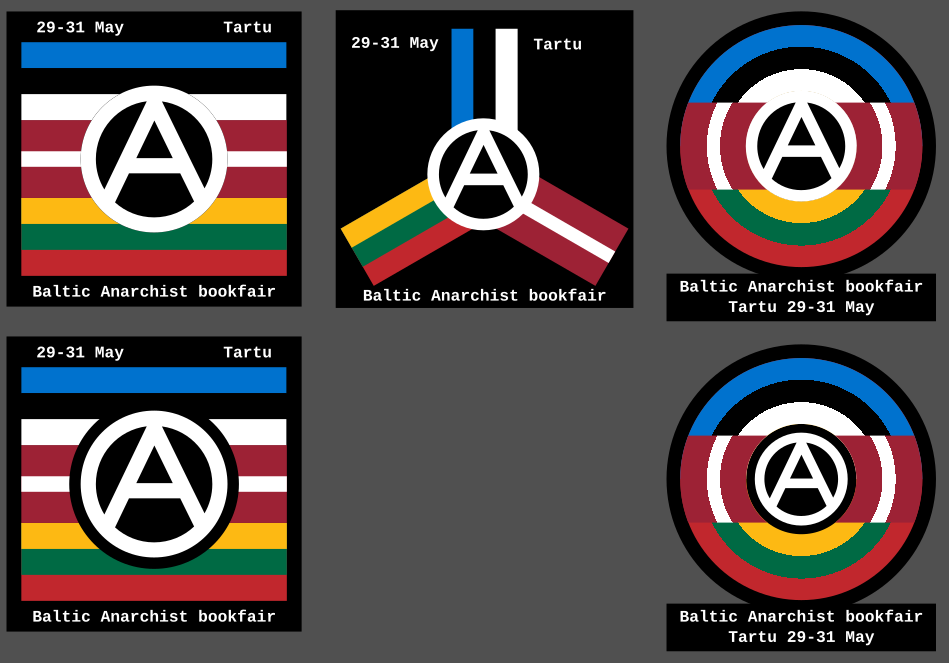
So I recently discovered there's an anarchist bookfair happening in Tartu, Estonia. So I made these icons as a way to contribute spreading the news. What do you think?
More info about the bookfair is here: https://riga-anarchist-bookfair.hotglue.me/
Discuss anarchist praxis and philosophy. Don't take yourselves too seriously.
Other anarchist comms
Join the matrix room for some real-time discussion.
Banner by @Val@anarchist.nexus
So I recently discovered there's an anarchist bookfair happening in Tartu, Estonia. So I made these icons as a way to contribute spreading the news. What do you think?
More info about the bookfair is here: https://riga-anarchist-bookfair.hotglue.me/
Hell yeah. Maybe switch black and white of the A? I don't know.
It's interesting for sure, but the A is very glaring. Making the border around the A bigger certainly improves it but then it starts covering up quite a lot of the flags. It also feels quite generic, I know the other ones are generic as well but this one just feels like "Take the flags and put an A over it." done.
I see what you mean. In that case take the one on the lower right of your original set.